

Project Overview
In today’s competitive digital environment, businesses need more than powerful software to succeed. They also need digital platforms that are easy to understand, simple to navigate, and designed around the needs of their customers.
CnEL India explored a UI/UX design opportunity for Avowis, an AI-powered business automation and customer engagement platform. The platform was already developed, but the business wanted to improve its overall user experience, simplify customer journeys, and create a more intuitive interface that could support higher conversions and better customer retention.
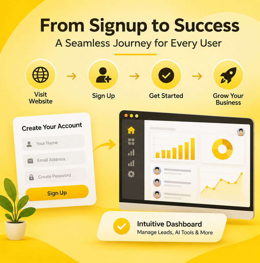
The project focused on three major areas: the public-facing website, the customer signup and onboarding process, and the business owner dashboard.
The primary objective was not simply to refresh the visual appearance of the platform. Instead, the goal was to understand how visitors and existing users interacted with the product, identify usability problems, and recommend practical design improvements that would make the platform easier to use.
The proposed UI/UX engagement would begin with an initial website audit, followed by a more detailed assessment of the onboarding experience and business owner dashboard. Based on these findings, the design work would focus on improving navigation, simplifying workflows, strengthening the visual presentation, and making important features easier to access.
For CnEL India, this project represented an opportunity to apply user-centered design principles to an existing SaaS product and help create a smoother experience for both potential customers and active business users.
Understanding the Business Requirements
The first step was to understand the platform’s business objectives and the challenges the company wanted to address.
Avowis provides AI-powered business automation and customer engagement capabilities. Such platforms can contain multiple features, workflows, and user controls. While these capabilities can provide significant value, users may find the experience complicated if the interface does not communicate the available functionality clearly.
The client wanted to improve the experience across the complete customer journey, starting from the moment a visitor arrives on the website and continuing through registration, account setup, and regular dashboard usage.
The key requirements included:
- Reviewing the existing website design and structure.
- Improving website layout, messaging, and navigation.
- Making the platform appear more professional and trustworthy.
- Improving the journey from website visits to registrations.
- Reviewing the existing signup and onboarding process.
- Identifying unnecessary steps and usability issues.
- Reducing friction during account creation.
- Improving business owner dashboard navigation.
- Making AI tools, leads, conversations, and customer interactions easier to manage.
- Creating clean and modern interface designs.
- Preparing developer-ready design specifications.
- Considering conversion optimization and customer retention.
These requirements highlighted the importance of treating the website, onboarding process, and dashboard as connected parts of one overall user experience.
A visitor should be able to understand the platform’s value, become a customer without unnecessary difficulty, and use the available features confidently after registration.
Website UI/UX Audit and Design Improvement
The public-facing website plays an important role in introducing a SaaS product to potential customers.
When visitors arrive on a website, they usually want to understand what the platform does, how it can help their business, and whether it is worth exploring further.
If the messaging is unclear, navigation is confusing, or important information is difficult to find, visitors may leave without signing up.
For Avowis, the initial requirement was to review the existing website and identify opportunities to improve its overall presentation and usability.
First Impressions and Visual Presentation
The first impression of a website can influence how visitors perceive a business.
A professional SaaS website should communicate its purpose clearly through its layout, visual hierarchy, content, and navigation.
The proposed audit would examine whether the website presents the platform’s main benefits in a way that visitors can understand quickly.
Important areas for review would include:
- Homepage structure and content arrangement.
- Headline clarity and supporting messaging.
- Visual consistency across website sections.
- Typography and readability.
- Colour usage and contrast.
- Placement of important information.
- Navigation structure.
- Calls to action.
- Mobile responsiveness.
- Overall professional appearance.
The purpose would be to identify design elements that create confusion or make it difficult for visitors to understand the product.
Improving Website Messaging
For an AI-powered business automation platform, communicating features alone may not be enough.
Visitors should understand the business problems the platform is designed to solve.
For example, instead of presenting only a list of AI features, the website could explain how the platform helps businesses manage customer interactions, organize leads, and improve repetitive workflows.
The audit would evaluate whether the messaging focuses on clear customer benefits and whether important information is presented in an understandable order.
The goal would be to make the platform’s value proposition easier to recognize.
Simplifying Navigation
Website navigation should help visitors find relevant information without unnecessary effort.
A complicated menu structure or poorly organized content can make the customer journey difficult.
The proposed improvements would focus on creating a logical navigation structure, making important sections easier to discover, and ensuring that visitors can move naturally between product information, benefits, and signup options.
Conversion Rate Optimization
An important objective of the project was to improve the website’s ability to convert visitors into registered users and potential paying customers.
Conversion rate optimization involves understanding how users behave and identifying elements that may prevent them from completing an intended action.
For Avowis, the primary conversion journey would involve moving from the public website to the signup process.
The audit would examine:
Call-to-Action Placement: Important actions should be visible and easy to understand. Visitors should not have to search for the next step.
Value Communication: The website should explain why someone should register and what they can expect after signing up.
Content Structure: Information should be organized so visitors can understand the product without navigating through unnecessary sections.
Trust and Credibility: A consistent visual identity, clear messaging, and relevant business information can help create confidence.
Mobile Experience: The website should remain easy to navigate on smaller screens, where visitors may interact with different layouts and controls.
Rather than making design changes based only on appearance, the proposed approach would connect each recommendation to a specific usability or conversion objective.
Signup and Customer Onboarding Optimization
The signup and onboarding process was another major part of the project.
For SaaS platforms, registration is one of the most important stages of the customer journey. If the process is complicated or requires unnecessary information, potential users may abandon it before completing their accounts.
After registration, the onboarding experience should help new customers understand the platform and begin using its features.
The client wanted this process reviewed to identify unnecessary steps, friction points, and possible reasons for customer drop-offs.
Reviewing the Existing Signup Flow
The first stage would involve understanding the current registration process and mapping each step a new user needs to complete.
The assessment would consider:
- Number of registration steps.
- Information requested from users.
- Form organization and clarity.
- Field labels and instructions.
- Validation messages.
- Error handling.
- Password and account creation requirements.
- Visibility of progress.
- Mobile usability.
- Clarity of the final registration action.
The objective would be to identify areas where users may experience confusion or unnecessary effort.
For example, if users are asked to provide information that is not essential during initial registration, some of those details could potentially be collected later during account setup.
Creating a Streamlined Onboarding Journey
Once the signup experience is reviewed, the next step would be to improve the process users follow after creating an account.
A well-designed onboarding experience should introduce the platform gradually rather than presenting every feature at once.
For an AI-powered business automation platform, new users may need guidance on setting up their accounts, understanding available features, and organizing their customer engagement activities.
The proposed onboarding improvements could include:
Clear Welcome Experience: Introduce users to the platform and explain the next steps after registration.
Guided Account Setup: Organize important account configuration activities into understandable stages.
Simple Instructions: Use clear labels and short explanations to help users understand what is required.
Progress Visibility: Show users which setup activities have been completed and what remains.
Feature Introduction: Help users discover relevant platform capabilities without overwhelming them.
Easy Navigation: Provide clear pathways between onboarding steps and the main dashboard.
The overall objective would be to help customers reach the point where they can begin using the platform’s value as quickly and comfortably as possible.
Business Owner Dashboard Redesign
The business owner dashboard was the third major project area.
Unlike the public website, which focuses on attracting potential customers, the dashboard is designed for people who actively use the platform to manage business activities.
The client specifically wanted to simplify the experience so business owners could manage their AI tools, leads, conversations, and customer interactions more easily.
A dashboard containing several features can become difficult to use if information is not organized logically.
The proposed design assessment would focus on understanding how business owners interact with different sections and identifying ways to reduce unnecessary navigation.
Improving Dashboard Navigation
Navigation is one of the most important elements of a SaaS dashboard.
Business owners should be able to locate frequently used features without searching through multiple sections.
The redesign would evaluate the existing navigation structure and consider whether the available features are grouped in a logical manner.
Potential improvements could include:
- Organizing features into clear categories.
- Improving sidebar or menu navigation.
- Making important sections easier to access.
- Creating consistent page layouts.
- Improving the visibility of important actions.
- Reducing unnecessary navigation steps.
- Maintaining a consistent experience across different sections.
The goal would be to make the dashboard easier to understand, particularly for business owners who may not have extensive technical knowledge.
Simplifying AI Tool Management
Since Avowis is an AI-powered platform, users need a clear way to understand and manage its available AI capabilities.
The dashboard should help business owners identify available functions and understand how to access them.
The proposed UI/UX improvements would focus on presenting these capabilities in an organized manner.
Each feature should have a clear purpose, understandable labels, and an accessible interface.
The intention would be to make AI functionality feel like a practical part of daily business operations rather than a complicated technical system.
Improving Lead and Customer Management
Leads and customer interactions are important components of business operations.
The dashboard needed to make these activities easier to manage.
A structured interface could help business owners understand their lead information, review customer conversations, and locate relevant interaction details.
The design assessment would examine how information is displayed, how users move between different records, and whether important actions are easy to find.
The proposed improvements would prioritize clarity, consistency, and efficient access to frequently used information.
Improving Conversation Management
Customer engagement platforms often involve multiple conversations and interactions.
If these are not presented clearly, business owners may find it difficult to follow communication activities.
The dashboard redesign would consider how conversations could be organized to make them easier to review and manage.
The objective would be to provide an intuitive communication experience with clear information hierarchy and accessible controls.
Creating a Consistent SaaS User Experience
A major consideration throughout the project would be maintaining consistency between the website, signup experience, onboarding flow, and dashboard.
These areas serve different purposes, but customers should experience them as parts of one connected platform.
For example, the visual language introduced on the public website should carry through into the registration and dashboard interfaces.
Similarly, labels, navigation patterns, buttons, and interaction styles should remain consistent wherever possible.
The proposed design system would consider:
- Consistent typography.
- Reusable interface components.
- Standardized buttons and form elements.
- Clear visual hierarchy.
- Consistent spacing and alignment.
- Accessible colour contrast.
- Responsive layouts.
- Predictable interaction patterns.
A consistent design system would also make future improvements easier to manage and help developers implement new screens without creating unnecessary visual differences.
Developer-Ready UI/UX Design
The client specifically wanted designs that developers could use during implementation.
This requirement was important because a successful redesign depends not only on the quality of the visual design but also on how clearly the design can be translated into a working application.
The proposed design delivery would focus on presenting complete layouts, interaction states, and reusable interface elements.
Important considerations would include:
- Page and screen layouts.
- Responsive design variations.
- Form and input states.
- Navigation behaviour.
- Button and interaction states.
- Empty and error states.
- Component consistency.
- Clear design specifications.
The objective would be to reduce ambiguity during development and make it easier for the technical team to understand how each screen should behave.
Initial Audit and Project Execution Strategy
The client requested an initial UI/UX assessment before moving forward with a complete redesign.
This was a practical approach because it would allow both sides to understand the existing experience and agree on the areas requiring attention.
The proposed engagement would be divided into clear stages.
Stage 1: Initial Website Review
Review the public website and assess its visual presentation, messaging, navigation, and signup journey.
Stage 2: UI/UX Assessment
Identify usability issues and prepare three to five specific recommendations covering the most important improvement opportunities.
Stage 3: Signup and Onboarding Review
After receiving the required access, evaluate the existing registration and account setup experience.
Stage 4: Dashboard Assessment
Review the business owner dashboard and understand how users manage AI tools, leads, conversations, and customer interactions.
Stage 5: Design Planning
Prioritize improvements according to user needs, business objectives, and implementation requirements.
Stage 6: UI/UX Design
Prepare improved layouts, user flows, and interface designs for the agreed project scope.
Stage 7: Design Handover
Provide organized, developer-ready design specifications for implementation.
The initial audit would help establish a clear understanding of the project before finalizing the complete redesign timeline and pricing.
Challenges and Key Considerations
The project involved several important challenges that needed to be considered during the design process.
Existing Platform Structure: Since the platform was already developed, the redesign needed to improve the experience while considering its existing functionality.
Complex SaaS Features: AI tools, lead management, conversations, and customer interactions needed to be presented in a simple and organized manner.
Signup Abandonment: Unnecessary registration steps or unclear instructions could prevent potential customers from completing the signup process.
User Experience Consistency: The website, onboarding flow, and dashboard needed to feel connected.
Conversion Objectives: Design recommendations needed to support measurable business goals rather than focusing only on visual appearance.
Developer Handover: Designs needed to communicate layouts and interactions clearly so that implementation could proceed smoothly.
Customer Retention: The dashboard and onboarding experience needed to help customers understand the platform and continue using its features.
Addressing these challenges would require a structured, user-centered approach supported by clear business priorities.
CnEL India’s Approach
CnEL India approaches UI/UX improvement projects by focusing on the relationship between business objectives, customer behaviour, and practical interface design.
For a project like Avowis, the first priority would be to understand the existing platform and review the experience from the perspective of different user types.
The process would begin with the requested initial website audit, followed by a detailed assessment of the signup flow and dashboard once the necessary access was available.
Rather than redesigning every screen immediately, the team would identify the most important usability issues and prioritize improvements according to their potential impact.
The website would be evaluated for clarity, navigation, trust, and conversion opportunities.
The signup and onboarding experience would be reviewed for unnecessary steps and friction.
The dashboard would be assessed for navigation, information organization, and ease of managing business activities.
CnEL India would then work toward creating a consistent, modern interface supported by reusable design elements and clear developer handover specifications.
This approach would help ensure that design decisions remain connected to the actual needs of the business and its customers.
Expected Business Benefits
A well-planned UI/UX improvement project could provide several advantages for an AI-powered SaaS platform.
Improved First Impressions: A professional website can help visitors understand the platform and develop confidence in the business.
Better Conversion Opportunities: Clear messaging, accessible calls to action, and a smoother signup journey can help reduce barriers to registration.
Simplified Onboarding: A guided account setup experience can help new users understand the platform more quickly.
Improved Dashboard Usability: Organized navigation can make it easier for business owners to access AI tools, leads, and conversations.
Better Customer Engagement: A more intuitive interface can encourage users to interact with the platform’s available features.
Consistent Brand Experience: A unified design approach can create a more professional experience across the website and application.
Easier Future Development: Reusable design components and clear specifications can support future improvements and feature expansion.
Stronger Customer Retention: A platform that is easier to understand and use can contribute to a more positive ongoing customer experience.
Conclusion
The Avowis UI/UX design opportunity highlights the importance of creating a customer experience that connects website presentation, registration, onboarding, and everyday platform usage.
For an AI-powered SaaS product, powerful functionality alone is not enough. Users need to understand the available capabilities, complete account setup without unnecessary difficulty, and manage their business activities through a clear and intuitive dashboard.
The proposed project focused on improving these experiences through structured audits, user journey optimization, conversion-focused design, and developer-ready interface planning.
For CnEL India, this represents an opportunity to support the evolution of an existing SaaS platform through practical UI/UX improvements that balance business objectives with user needs.
By prioritizing usability, consistency, accessibility, and customer behaviour, the platform can work toward delivering a smoother digital experience and creating a stronger foundation for future growth.