

Project Overview
CnEL India worked on a website development project focused on creating a polished, responsive, and user-friendly digital presence for a business that needed its website to perform consistently across desktop and mobile devices.
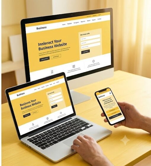
The project required more than simply creating a website that could technically open on different screen sizes. The objective was to develop a complete digital experience where the visual design, navigation, content structure, functionality, and overall user experience remained consistent regardless of the device being used.
Today, users access business websites from a wide range of devices. A visitor may discover a business through a desktop computer, continue browsing from a tablet, or complete an important action from a mobile phone. A website that performs well on only one type of device can therefore create friction and negatively affect the overall user experience.
CnEL India approached the project with a responsive-first development strategy. The website structure was planned around flexible layouts, scalable components, intuitive navigation, optimized content presentation, and device-specific usability considerations.
The final objective was to deliver a professional website that looked consistent, worked smoothly, and remained easy to use across desktop and mobile environments.
Business Challenge
The client required a website that could represent the business professionally while providing a smooth experience for visitors across different devices.
A common challenge in website development is designing primarily for desktop and treating mobile responsiveness as an afterthought. This can lead to several problems, including:
- Content becoming difficult to read on smaller screens.
- Navigation menus becoming complicated.
- Buttons being too small to interact with comfortably.
- Images extending beyond the screen.
- Sections becoming unnecessarily long.
- Important information being difficult to locate.
- Forms becoming difficult to complete.
- Inconsistent spacing between devices.
- Slow-loading pages caused by poorly optimized content.
- Different visual experiences across desktop and mobile.
The client wanted to avoid these issues from the beginning.
The website needed to provide a consistent visual identity while adapting naturally to different screen sizes.
The project therefore required careful attention to both design and implementation.
Project Objectives
CnEL India established several key objectives for the project:
- Build a professional business website.
- Create a clean and visually consistent design.
- Ensure complete responsiveness across desktop and mobile devices.
- Develop clear and intuitive navigation.
- Implement the required website functionality.
- Maintain consistent branding across screen sizes.
- Optimize content presentation for smaller displays.
- Create mobile-friendly forms and interactive elements.
- Ensure the website performs smoothly across common devices.
- Test the website across multiple screen sizes.
- Deliver a polished final product that is easy to maintain.
- Create a scalable structure that can support future improvements.
The project was therefore approached as a complete user-experience and development assignment rather than simply a page-building exercise.
Understanding the Business and User Journey
Before development began, the website requirements were considered from the perspective of both the business and its visitors.
A business website typically needs to perform several functions simultaneously.
It may need to introduce the company, explain its services, build trust, provide important information, generate inquiries, and guide visitors toward specific actions.
CnEL India considered these requirements while planning the structure of the website.
Important questions included:
- What should visitors understand immediately?
- What information should appear first?
- Which pages are most important?
- What actions should users be able to take?
- How should visitors move between sections?
- Which content requires greater visibility?
- How should the same information be presented on mobile?
This user-centered approach helped create a more logical website structure.
Website Architecture and Content Structure
A well-designed website requires a clear information hierarchy.
CnEL India organized the website structure so that visitors could understand the business and navigate toward relevant information without unnecessary effort.
The architecture could include areas such as:
- Homepage.
- About the business.
- Services or products.
- Individual service sections.
- Contact information.
- Inquiry forms.
- Supporting informational pages.
Each section was structured according to its purpose.
The homepage was designed to communicate the primary value proposition quickly, while supporting pages provided additional information for users who wanted to explore specific areas in greater detail.
The goal was to prevent visitors from feeling overwhelmed while still providing enough information to support informed decisions.
Clean and Modern Visual Design
The visual direction focused on simplicity and clarity.
A clean design does not necessarily mean removing all visual elements. Instead, it means ensuring that every visual element has a clear purpose.
CnEL India focused on:
- Balanced spacing.
- Clear typography.
- Consistent visual hierarchy.
- Structured content sections.
- Appropriate use of images.
- Strong call-to-action placement.
- Consistent buttons.
- Clear headings.
- Easy-to-scan content.
The design was also created with consistency in mind.
Colors, typography, spacing, buttons, cards, forms, and other interface elements followed a common visual language.
This helped the website feel like one complete product rather than a collection of unrelated pages.
Responsive Website Development
Responsive behavior was one of the central requirements of the project.
Instead of creating completely separate websites for desktop and mobile, the development approach used a flexible layout system capable of adapting to different screen sizes.
This required consideration of:
- Desktop displays.
- Laptops.
- Tablets.
- Standard mobile phones.
- Larger mobile screens.
Page layouts were structured so that content could resize, reposition, or stack appropriately as the available screen width changed.
For example, a multi-column desktop section could transition into a vertically stacked mobile layout.
Navigation could also change from a full desktop menu into a compact mobile-friendly structure.
This approach provided a consistent experience while allowing the interface to adapt naturally to the device.
Mobile Experience
Mobile users often interact with websites differently from desktop users.
They typically have less screen space and may navigate using touch rather than a mouse.
CnEL India therefore considered mobile usability during the development process.
Important elements such as buttons, navigation controls, forms, and links were designed with touch interaction in mind.
Text sizes and spacing were also reviewed to ensure that users did not need to zoom unnecessarily.
Images and other visual elements were adjusted so that they remained contained within the screen and did not create horizontal scrolling.
The objective was to make the mobile experience feel intentionally designed rather than simply compressed from the desktop version.
Navigation and User Experience
Navigation is one of the most important components of a business website.
Even a visually attractive website can become difficult to use if visitors cannot quickly find the information they need.
CnEL India therefore focused on creating straightforward navigation.
Navigation elements were organized around the most important areas of the website.
The hierarchy was kept simple so users could understand where they were and where they could go next.
On smaller screens, the navigation structure was adapted to provide an uncluttered experience without sacrificing access to important pages.
The result was a more predictable journey for both desktop and mobile users.
Core Website Functionality
Along with visual development, the project included implementation of the required website functionality.
Depending on the business requirements, this could include:
- Contact forms.
- Inquiry submissions.
- Navigation between pages.
- Interactive sections.
- Service information.
- Call-to-action buttons.
- Mobile navigation.
- Content sections.
- Basic validation.
- Confirmation messages.
Each functional component was implemented with usability in mind.
The goal was to ensure that functionality supported the overall user journey rather than becoming an independent technical layer.
For example, a contact form should not simply collect information. It should make the submission process clear and straightforward for the user.
Forms and Conversion Elements
Forms are often an important part of a business website because they allow visitors to initiate contact.
CnEL India considered the form experience across both desktop and mobile devices.
Form fields were structured clearly, labels were easy to understand, and interactive elements were sized appropriately for touch devices.
Validation was also considered to help users identify missing or incorrect information before submission.
Call-to-action elements were placed strategically throughout the website so visitors could take the next step when they were ready.
This helped connect website content with the business objective of generating inquiries and engagement.
Performance Considerations
Responsive design and visual quality need to be balanced with performance.
Large images, unnecessary page elements, excessive animations, and inefficient implementation can negatively affect loading speed, particularly on mobile devices.
CnEL India therefore considered performance during development rather than waiting until the final stage.
The implementation focused on:
- Optimized visual assets.
- Efficient page structure.
- Reduced unnecessary elements.
- Appropriate image sizing.
- Clean frontend implementation.
- Responsive asset behavior.
- Efficient loading of page resources.
The objective was to create a website that looked polished without becoming unnecessarily heavy.
Cross-Device Testing
Testing was an important stage of the development process.
A responsive website cannot be considered complete simply because it works on one desktop screen and one mobile phone.
Different screen dimensions can produce different layout behavior.
CnEL India therefore tested the website across multiple viewport sizes and device categories.
Testing focused on:
- Navigation.
- Layout structure.
- Text readability.
- Image scaling.
- Button placement.
- Forms.
- Spacing.
- Horizontal overflow.
- Mobile menus.
- Interactive components.
- Page consistency.
Each major page and functional component was reviewed to ensure that the user experience remained stable across different screen sizes.
Cross-Browser Compatibility
Users may access the website through different browsers and operating environments.
The website therefore required compatibility testing to identify inconsistencies in layout or functionality.
CnEL India reviewed important pages and interactions across commonly used browsing environments.
Potential issues such as spacing differences, unsupported behavior, layout shifts, and interactive problems were identified and corrected where necessary.
This helped create a more reliable experience for the wider user base.
Quality Assurance
Quality assurance was integrated into the development process rather than being treated as a final checklist.
Each stage was reviewed for both functional and visual quality.
The quality-assurance process included:
- Page-by-page testing.
- Responsive layout testing.
- Navigation testing.
- Form testing.
- Content review.
- Visual consistency checks.
- Interactive element testing.
- Mobile usability testing.
- Performance review.
- Final regression testing.
When an issue was identified, it was corrected and tested again to ensure that the change did not introduce another problem.
This iterative approach helped improve the overall stability of the website.
Visual Consistency Across Devices
One of the most important outcomes of responsive development was maintaining the business’s visual identity across devices.
The desktop version and mobile version did not need to look identical in terms of layout.
Instead, they needed to feel like the same website.
This was achieved through consistent:
- Branding.
- Typography.
- Color usage.
- Button styles.
- Image treatment.
- Content hierarchy.
- Spacing principles.
- Navigation patterns.
At the same time, layouts were allowed to adapt where necessary to provide better usability on smaller screens.
This balance between consistency and flexibility is an important part of effective responsive design.
Business Benefits
Professional Digital Presence
The completed website provided the business with a polished online presence that could represent its services effectively.
Better Mobile Accessibility
Visitors using mobile devices could access the same core information without dealing with broken layouts or difficult navigation.
Consistent Brand Experience
The visual language remained consistent across desktop, tablet, and mobile experiences.
Improved Usability
Clear navigation, structured content, and accessible interaction patterns made the website easier to use.
Better Customer Engagement
Strategically placed calls to action and simplified forms created clearer paths for visitors who wanted to contact the business.
Reduced Maintenance Complexity
A responsive structure allowed the business to maintain a unified website experience rather than managing completely separate desktop and mobile versions.
Future Scalability
The website architecture provided a foundation for future pages, features, content updates, and business requirements.
CnEL India’s Contribution
CnEL India approached the project as a combination of website development, responsive design, user experience, and quality assurance.
The focus was not simply on making pages look good.
The development process considered how users would interact with the website, how content would adapt across screen sizes, how business goals could be supported through navigation and calls to action, and how the website could remain maintainable in the future.
The team worked across the complete development lifecycle, including website structure, interface development, responsive behavior, core functionality, testing, and final refinement.
This ensured that the final product was both visually polished and practically usable.
Future Scalability
A well-structured responsive website can serve as a foundation for future digital growth.
As the business expands, additional services, product pages, content sections, forms, customer features, or integrations can be introduced without redesigning the entire experience.
The responsive design system can also be extended to new pages so that future additions remain visually consistent with the existing website.
Performance and usability standards established during the initial project can continue to guide future development.
This makes the website more than a one-time digital asset. It becomes a scalable platform for the business’s ongoing online presence.
Conclusion
The responsive website development project demonstrated the importance of combining visual design, functionality, usability, and technical quality into one unified digital experience.
CnEL India developed the project around the principle that a modern business website must work effectively wherever users access it.
The focus therefore extended beyond desktop development to include mobile usability, responsive layouts, intuitive navigation, optimized content presentation, interactive functionality, performance, and cross-device testing.
The final approach created a professional and consistent website experience while providing the flexibility required for different screen sizes.
By combining responsive development with user-centered planning and structured quality assurance, CnEL India helped establish a strong digital foundation that could support the business’s current requirements and future growth.