

Introduction
A website’s hero banner is one of the first elements visitors notice when they land on a webpage. It often contains a background image, a headline, supporting text, and a call-to-action button. Since this section usually appears at the top of the page, its visual presentation plays an important role in creating a positive first impression and communicating the website’s primary message.
For businesses, an effective hero banner should do more than simply display attractive imagery. It should guide visitors toward important information, maintain a clear visual hierarchy, and provide a comfortable browsing experience across different screen sizes.
CnEL India recognizes that even small design adjustments can make a meaningful difference to a website’s overall appearance and usability. One such requirement involves changing the position of text displayed over a hero banner. In this case study, we explore a website customization requirement where the existing text was automatically centered over the banner image, while the desired layout required the content to be positioned toward one side.
The objective was to understand how this adjustment could be implemented through responsive CSS while preserving the existing website design, typography, and functionality.
Understanding the Client’s Requirement
The client had an existing website with a hero banner containing text displayed over a background image. The current layout automatically positioned the text in the center of the banner.
Although centered text is a common design choice, it is not always suitable for every image or website layout. Depending on the background image, centered text may cover important visual elements, create an unbalanced composition, or make the banner look different from the intended design.
The client wanted the text moved toward one side of the image instead of remaining in the center.
The requirement was specific and focused. There was no need to redesign the complete banner or rebuild the website. The requested customization involved adjusting the positioning of the existing text overlay while keeping the original visual identity intact.
The main requirements included:
- Moving the hero banner text away from the center toward one side of the image.
- Maintaining the existing background image and overall banner appearance.
- Preserving the current fonts, text styling, and design elements.
- Ensuring the positioning worked properly on desktop screens.
- Adjusting the layout for mobile devices and smaller screen sizes.
- Maintaining existing buttons, links, and other banner functionality.
- Completing the customization accurately within a short timeframe.
The central challenge was to make a relatively small CSS change without introducing unexpected layout problems elsewhere on the website.
Why Hero Banner Text Positioning Matters
Hero banners are important visual components because they communicate a website’s message immediately. Visitors often decide whether to continue exploring a website based on what they see in its opening section.
Text positioning directly influences how effectively this information is presented.
For example, if a banner image contains a person, product, building, or other important visual element in the center, placing text directly over that area may reduce the image’s impact. Moving the text toward the left or right can create a more balanced composition.
A well-positioned text overlay can provide several benefits:
1. Better Visual Balance
The relationship between the text and background image determines how balanced a banner appears. Moving the text toward an area with sufficient empty space can help maintain a clean and organized appearance.
2. Improved Readability
Text should remain easy to read against the background image. Its position, spacing, and alignment can influence how clearly visitors understand the headline and supporting information.
3. Better Use of Image Space
Different images have different compositions. A fixed center-aligned layout may not work equally well with every background image. Flexible positioning allows the website to use the available visual space more effectively.
4. Stronger Design Consistency
A website should maintain a consistent visual identity across its pages. Adjusting the banner text without changing its typography, colors, or other styling helps preserve the existing design language.
5. Improved User Experience
A clear hero banner helps visitors understand the page’s purpose and identify important actions. Better text placement can make the opening section easier to navigate and visually more comfortable.
Technical Approach to CSS Customization
The main focus of this requirement was CSS-based positioning. Since the website already had a working hero banner, the most practical approach was to inspect the existing structure and identify which styling rules controlled the text overlay.
CSS provides several methods for positioning content within a banner. The appropriate method depends on the website’s existing layout and how its elements are organized.
Reviewing the Existing Layout
Before making changes, the existing hero banner needs to be examined carefully.
The review includes identifying:
- The main hero banner container.
- The background image and its display settings.
- The text overlay container.
- The headline and supporting text elements.
- Existing alignment and spacing properties.
- The relationship between the banner and other page sections.
This initial inspection helps identify the reason the text is currently centered.
For example, the existing layout may use horizontal and vertical centering through a flexible container, automatic margins, text alignment, or absolute positioning. Understanding the current arrangement makes it easier to adjust the correct element instead of applying unnecessary changes to the entire banner.
Adjusting Horizontal Alignment
The primary requirement is to move the text toward one side of the background image.
Depending on the existing structure, this can be achieved by adjusting the horizontal alignment of the content container, modifying its position, or changing its spacing within the parent element.
For a flexible layout, the alignment can be controlled through appropriate container properties. In another layout, positioning rules may be more suitable.
The selected approach should respect the existing banner structure and avoid affecting unrelated sections of the website.
The objective is not simply to move the text visually. It is to create a stable layout that behaves correctly when the screen width changes.
Maintaining Vertical Alignment
While the horizontal position needs to change, the vertical placement should also be reviewed.
The headline and supporting content should remain appropriately positioned within the banner. Moving the text toward the left or right should not cause it to become too close to the top or bottom edge.
Consistent vertical spacing helps preserve the original visual hierarchy and makes the banner appear professionally designed.
Preserving Existing Typography
The client specifically wanted the existing fonts and design to remain unchanged.
Therefore, the customization should focus on positioning rather than modifying the appearance of the text.
Important styling elements to preserve include:
- Font family.
- Font size and weight.
- Text color.
- Line height.
- Letter spacing.
- Headline formatting.
- Supporting text styling.
- Button appearance.
This ensures that the updated banner continues to match the rest of the website.
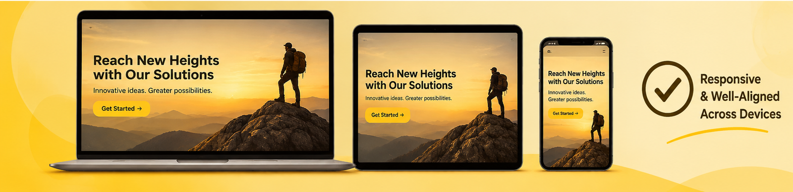
Responsive Design for Desktop and Mobile
One of the most important parts of this requirement is responsiveness.
A layout that looks attractive on a desktop monitor may not work properly on a mobile device. Desktop screens provide more horizontal space, allowing text to sit comfortably toward the left or right side of an image. Mobile screens have limited width, which requires a different arrangement.
The CSS customization must account for these differences.
Desktop Layout
On desktop devices, the banner usually has enough space to display text toward one side while keeping the background image visible.
The positioning should consider:
- The width of the text container.
- The available empty space in the background image.
- Distance from the left or right edge.
- Headline wrapping.
- Button placement.
- Overall banner height.
The text should remain visually balanced without covering important image content.
The exact horizontal position can be adjusted according to the image composition and existing design.
Tablet Layout
Tablet devices occupy an intermediate screen size. A desktop layout may still work on some tablets, but the reduced width can cause text to wrap differently.
The responsive design should therefore be checked at tablet-sized widths.
The content container may require adjusted spacing or a different maximum width to prevent the text from becoming crowded.
Mobile Layout
Mobile devices require particular attention because the available screen space is significantly smaller.
A text position that works on desktop may overlap with the main subject of the image or become difficult to read on a phone.
Responsive CSS rules can be used to modify the text alignment, width, margins, and spacing for smaller screens.
The mobile layout should ensure that:
- The headline remains readable.
- Supporting text does not become excessively narrow.
- Buttons remain visible and accessible.
- Text does not overflow the banner.
- Important background image elements remain visible.
- The content maintains sufficient spacing from screen edges.
The goal is to retain the client’s requested design direction while making practical adjustments for smaller devices.
Preserving Existing Website Functionality
A small visual customization should not create problems for the rest of the website.
The hero banner may contain links, buttons, promotional messages, navigation elements, or other interactive components. These elements should continue working after the CSS changes.
For this reason, the implementation should avoid unnecessary modifications to the website’s underlying structure.
The development approach should focus on the smallest effective styling changes.
Existing functionality that needs to be preserved includes:
- Call-to-action button links.
- Clickable banner elements.
- Text visibility.
- Background image display.
- Existing responsive behavior.
- Relationships between the banner and nearby sections.
It is also important to ensure that the updated positioning does not interfere with other page elements or cause unexpected overlapping.
Implementation and Testing Process
A reliable CSS customization process involves more than changing a single alignment property. The updated layout should be reviewed across different screen sizes and browser conditions.
CnEL India’s proposed implementation approach can be organized into the following stages.
Stage 1: Website and Banner Inspection
The first step is to review the existing webpage and identify the hero banner structure.
The developer examines the current text alignment, container dimensions, background image settings, and existing responsive styles.
This helps determine the most suitable method for making the requested adjustment.
Stage 2: Identifying the Required CSS Changes
After reviewing the layout, the relevant styling rules are identified.
The developer determines whether the current positioning is controlled through flexible alignment, margins, positioning properties, or other layout settings.
Only the necessary CSS properties should be modified wherever possible.
Stage 3: Implementing the New Position
The text container is moved toward the requested side of the banner.
The adjustment should maintain suitable spacing from the image boundaries and preserve the relationship between the headline, supporting text, and call-to-action elements.
The implementation should also avoid unnecessary changes to the original design.
Stage 4: Adding Responsive Adjustments
Responsive rules are reviewed and updated for desktop, tablet, and mobile screen sizes.
The desktop layout should display the text toward the intended side, while smaller screens should use suitable spacing and alignment to maintain readability.
This stage is particularly important because responsive layouts can behave differently depending on the length of the text and the dimensions of the image.
Stage 5: Visual and Functional Testing
Once the changes are implemented, the updated banner should be tested at different screen widths.
The review should include:
- Desktop display.
- Tablet display.
- Mobile display.
- Headline and paragraph alignment.
- Text readability.
- Button visibility.
- Background image positioning.
- Banner spacing.
- Existing links and functionality.
Any unexpected wrapping, overlapping, or spacing issues should be corrected before considering the customization complete.
Stage 6: Final Review
The final review confirms that the text is positioned as requested and that the original website design remains consistent.
The updated banner should look natural across different devices without affecting the surrounding webpage.
Challenges and Important Considerations
Although this is a small development task, several details can influence the final result.
Different Background Image Compositions
The amount of empty space available in an image varies. Some images have their main subject on the left, while others have it on the right.
The text position should be selected with the image composition in mind. A fixed position that works for one image may not be suitable for another.
Text Length and Wrapping
A short headline may fit comfortably in a narrow content area, while a longer headline may require additional width.
The developer should review the actual content rather than assuming that all text will occupy the same amount of space.
Responsive Spacing
A horizontal position that looks correct on a large screen may leave insufficient space on a mobile device.
Responsive spacing rules help prevent text from touching the screen edges or overlapping other elements.
Avoiding Unnecessary Redesign
The client did not request a new banner design. The objective was to adjust the existing text position.
Changing colors, typography, images, or other visual elements unnecessarily could move the result away from the client’s expectations.
A focused customization is therefore the most appropriate approach.
Compatibility With Existing Styles
Websites may contain multiple CSS rules affecting the same element. New styling should be implemented carefully to avoid conflicts with existing rules.
The developer should also check that the adjustment does not unintentionally affect similar elements on other pages.
Expected Outcomes and Business Benefits
A successful implementation of this customization is expected to improve the hero banner’s visual presentation while maintaining its existing identity.
The expected benefits include:
Improved Banner Composition: Moving the text toward one side can create a more balanced relationship between the content and background image.
Better Content Visibility: The text can be positioned in an area that provides sufficient visual space, helping visitors focus on the main message.
Consistent Brand Appearance: Preserving the original fonts, colors, and design elements ensures that the updated banner remains consistent with the website’s overall identity.
Responsive User Experience: Suitable adjustments for desktop, tablet, and mobile devices help maintain a comfortable browsing experience across screen sizes.
Minimal Development Changes: Since the requirement is limited to CSS positioning, a focused implementation can avoid unnecessary modifications to the existing website.
Reduced Maintenance Complexity: Keeping the existing structure intact can make the customization easier to maintain in the future.
These outcomes demonstrate why small front-end improvements can contribute to the overall quality of a website.
How CnEL India Approaches Small Website Customizations
CnEL India provides website development and customization services designed around practical business requirements. Not every website improvement requires a complete redesign or extensive development work.
Sometimes, a focused adjustment to an existing section can solve a specific usability or presentation problem.
For a requirement like hero banner text positioning, our approach emphasizes understanding the existing website before making changes.
We focus on identifying the actual cause of the layout issue, selecting an appropriate CSS solution, and checking the result across different devices.
Our development priorities include:
- Understanding the client’s exact visual expectations.
- Preserving existing website functionality.
- Maintaining the original design wherever possible.
- Applying responsive layout improvements.
- Avoiding unnecessary structural changes.
- Testing the updated section across screen sizes.
- Delivering a clean and maintainable customization.
This approach helps ensure that even small website updates are handled with attention to detail.
Conclusion
Hero banner text positioning may appear to be a minor design adjustment, but it can have a noticeable effect on how visitors experience a website.
In this case study, the requirement was to move automatically centered text toward one side of an existing hero banner while preserving the background image, typography, design, and functionality.
The most suitable solution involves reviewing the current layout, identifying the relevant CSS positioning rules, adjusting the text container, and applying responsive styling for desktop, tablet, and mobile devices.
Careful testing is equally important to ensure that the updated layout remains readable, visually balanced, and functional across different screen sizes.
CnEL India understands the value of practical website improvements that address specific business needs without introducing unnecessary complexity. Through focused CSS customization and responsive design practices, we aim to help businesses maintain professional, user-friendly, and visually consistent websites.
A small adjustment, when implemented correctly, can make an existing website feel more polished while preserving everything that already works.