Executive Overview
In today’s digital landscape, simplicity often outperforms complexity. Businesses increasingly prefer one-page websites that communicate clearly, load quickly, and guide users toward a specific action without distraction.
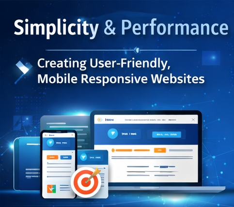
This case study explores how CnEl India Private Limited designed and developed a modern, mobile-responsive, one-page WordPress website focused on clarity, user experience, and conversion optimization. The project demonstrates how thoughtful design and structured content can transform a simple website into a powerful business asset.
Client Context
The client approached us with a straightforward requirement:
they needed a clean, professional, one-page website to present their services and generate inquiries.
Their previous online presence lacked:
- Clear messaging
- Structured layout
- Strong visual hierarchy
- Mobile optimization
- Conversion-focused design
The goal was not to build a complex website, but to create a simple yet impactful digital presence that communicates effectively and builds trust instantly.
The Core Challenge
While the project scope seemed simple, the real challenge was achieving maximum impact with minimal complexity.
Key challenges included:
- Presenting all essential information within a single page
- Maintaining a clean and uncluttered layout
- Creating strong visual flow to guide users
- Ensuring mobile responsiveness across all devices
- Designing for conversions (not just aesthetics)
- Balancing simplicity with professionalism
The website needed to be visually appealing, easy to navigate, and action-driven.
CnEl India’s Design Philosophy
At CnEl India, we believe that effective websites are built on three pillars:
- Clarity – Users should understand the message instantly
- Structure – Content should guide users naturally
- Action – Every section should lead toward a goal
For this project, we applied a minimalist and conversion-focused approach, ensuring every element served a purpose.
Strategic Approach
1. Understanding User Intent
Before starting the design, we analyzed the target audience and user behavior patterns.
We focused on:
- What users expect to see first
- What builds trust quickly
- What motivates users to take action
This helped us structure the entire page around user psychology rather than just design trends.
2. Defining a Clear Content Structure
A strong one-page website depends heavily on content flow.
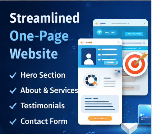
We organized the page into logical sections:
- Hero section (first impression)
- About section (build trust)
- Services section (highlight value)
- Testimonials (social proof)
- Contact section (conversion point)
Each section was designed to answer a specific user question, creating a smooth narrative.
3. Designing for Visual Hierarchy
To avoid clutter and confusion, we focused on visual hierarchy.
Key techniques included:
- Clear headings and subheadings
- Strategic use of whitespace
- Balanced spacing between sections
- Consistent typography and color usage
This ensured users could scan the page easily and absorb information quickly.
4. Creating a Strong First Impression (Hero Section)
The hero section is the most critical part of a one-page website.
We designed it to:
- Clearly communicate the business value
- Include a strong headline and supporting text
- Add a prominent call-to-action
- Use clean visuals that reinforce the message
This section was optimized to capture attention within seconds.
5. Service Presentation with Clarity
Instead of overwhelming users with too much information, we presented services in a simple and structured format.
- Short descriptions
- Easy-to-understand language
- Clean layout with visual separation
- Focus on benefits rather than features
This made it easier for users to understand what the business offers.
6. Building Trust Through Testimonials
Trust is essential for conversions.
We included a testimonial section that:
- Highlights positive client feedback
- Reinforces credibility
- Adds authenticity to the website
The design ensured testimonials were noticeable but not overpowering.
7. Conversion-Focused Call-to-Actions
Every section of the page was aligned toward a single goal: user action.
We strategically placed call-to-action elements:
- In the hero section
- After service descriptions
- Near the bottom of the page
These prompts were clear, visible, and action-oriented.
8. Mobile-First Design Approach
With the majority of users accessing websites on mobile devices, responsiveness was a top priority.
We ensured:
- Smooth layout across all screen sizes
- Proper spacing and readability on mobile
- Optimized images for faster loading
- Touch-friendly navigation
The website delivered a consistent experience across devices.
9. Performance Optimization
A fast website improves both user experience and search visibility.
We optimized:
- Image sizes and formats
- Page loading speed
- Clean code structure
- Minimal use of heavy elements
This ensured quick loading times and smooth performance.
10. Simple Contact Experience
The contact section was designed to reduce friction.
We implemented:
- A clean and minimal form
- Easy-to-fill fields
- Clear instructions
- Quick submission process
This increased the chances of user inquiries.
Execution Highlights
During development, CnEl India ensured:
- Clean and maintainable design structure
- Consistent styling across all sections
- Smooth scrolling and transitions
- Alignment between design and functionality
- Quick turnaround without compromising quality
Transformation Achieved
The final result was a modern, clean, and highly functional one-page website.
1. Improved User Experience
Users could easily navigate and understand the website without confusion.
2. Clear Communication
The business message became direct, structured, and impactful.
3. Higher Engagement
The improved layout encouraged users to explore the page fully.
4. Increased Conversions
Strategic placement of call-to-actions led to better inquiry rates.
5. Strong Brand Impression
The clean and professional design enhanced credibility and trust.
What Made This Project Stand Out
This project was not about adding more features—it was about doing less, but better.
What made CnEl India different:
- Focus on user psychology, not just design
- Minimalist approach with maximum impact
- Strong emphasis on clarity and usability
- Conversion-focused structure
- Attention to detail in spacing and layout
Long-Term Value for the Client
The delivered website provides:
- A strong digital presence
- Easy scalability for future updates
- Improved customer engagement
- Better lead generation potential
- A solid foundation for digital marketing
Key Takeaways
This project highlights important principles for modern website design:
- Simplicity can be more powerful than complexity
- Clear structure improves user experience
- Design should guide users, not confuse them
- Mobile optimization is essential
- Every element should serve a purpose
Conclusion
Through a strategic and user-focused approach, CnEl India Private Limited successfully delivered a high-impact one-page WordPress website that combines simplicity, performance, and conversion-driven design.
This case study demonstrates that even simple projects, when executed thoughtfully, can create powerful business outcomes. A well-designed one-page website is not just a digital presence—it is a tool for growth, engagement, and success.