
Introduction
In the modern food and snack industry, a website is much more than an online store. It is an important part of the brand experience. Customers often form their first impression of a food company by looking at its website, product images, packaging, categories, and overall presentation. When a brand has high-quality products but an outdated website, there can be a clear gap between the quality of the products and the way customers perceive the business.
CnEL India approached this type of challenge through a complete website redesign project for a growing snack and food brand. The objective was not simply to make small visual changes, but to transform an existing online store into a modern, attractive, premium-looking shopping experience.
The client wanted the website to better represent the quality of the company and its products. The existing website was considered outdated and needed a fresh visual direction. The redesign also required new product photography, better product arrangement, improved presentation, and alignment with the company’s current product line.
The project was therefore focused on combining visual branding, product merchandising, usability, and e-commerce functionality into one consistent website experience.
Understanding the Business
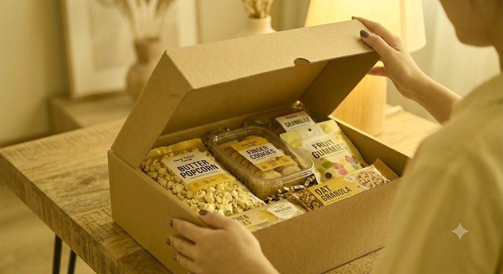
The client operates in the snack and food category, offering a variety of products across different snack segments. The current product range includes categories such as candies, cookies and macaroons, gummy products, sour candy, marshmallow products, popcorn, crackers, granola products, and other snack items.
With a diverse product catalog, the website needs to do more than simply display individual products. It must help visitors understand the brand, discover different product categories, compare products, and move naturally toward purchasing.
The brand also needs to communicate quality through visual presentation. Food products are highly visual, and customers expect attractive product photography, clear packaging images, appealing layouts, and a strong sense of brand identity.
This created an important opportunity for the redesign.
Instead of treating the website as a basic product catalog, the project aimed to create a digital storefront that would feel closer to a premium food brand.
The Existing Website Challenge
The biggest challenge was the outdated appearance of the existing website.
Although the business already had a functioning online presence and a range of products, the visual presentation did not fully communicate the quality or ambition of the brand. A website can remain technically functional while still feeling old-fashioned, difficult to navigate, or visually inconsistent.
Several areas therefore required attention.
The first was the overall visual design. The layout needed to become cleaner, more modern, and more visually engaging.
The second was product presentation. Food products depend heavily on images, and stronger photography could make the products more attractive and easier to understand.
The third was product organization. As the company’s product line changed, the website needed to reflect the current range instead of simply maintaining an older arrangement.
The fourth was the overall shopping journey. Customers should be able to move from the homepage to a category, from a category to a product, and from a product toward purchase without unnecessary confusion.
The redesign therefore needed to improve both appearance and usability.
Project Objectives
The primary objective was to modernize the website while maintaining its purpose as an online shopping destination.
The key objectives included:
- Creating a premium and modern visual identity
- Improving the homepage presentation
- Adding stronger and more appealing product photography
- Rearranging products according to the current product line
- Improving category organization
- Creating a cleaner product browsing experience
- Making product pages more visually attractive
- Improving navigation and customer journey
- Strengthening the overall food-brand image
- Creating a consistent visual experience across the website
- Making the website more suitable for modern customers and online shopping
The redesign was intended to make the website feel fresh without losing the identity and product variety that already existed.
Developing a Premium Visual Direction
One of the most important parts of the project was establishing the right visual direction.
A premium snack company needs a website that immediately communicates quality. This does not necessarily mean using complicated graphics or excessive design elements. Instead, premium presentation comes from thoughtful spacing, strong imagery, consistent typography, attractive product layouts, and clear visual hierarchy.
The redesign therefore focused on creating a cleaner interface with more breathing room around products and content.
The homepage was treated as the main brand introduction. Rather than immediately overwhelming visitors with large amounts of product information, the design could guide customers through the brand story, major product categories, featured products, and important shopping sections.
Large, high-quality food photography became an important part of the visual strategy.
The objective was to make visitors feel that they were looking at a premium food brand rather than simply browsing a basic online catalog.
Improving Product Photography
Product photography was another major part of the redesign.
For food and snacks, images have a direct effect on purchasing decisions. Customers cannot physically touch or taste a product through an online store, so photographs must communicate appearance, packaging, quality, flavor, and overall appeal.
The redesigned website therefore required better product imagery and stronger visual presentation.
Instead of relying only on basic product shots, the website could combine different types of imagery, including:
- Clean product images
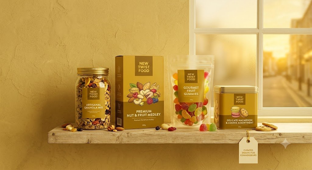
- Packaging photographs
- Close-up product shots
- Lifestyle images
- Flavor-focused visuals
- Product-in-use photographs
- Category banners
- Promotional imagery
This approach gives the website more visual depth.
It also allows products to be presented in different contexts rather than showing every item in exactly the same way.
Rearranging the Product Catalog
The client specifically wanted products rearranged to match the current product line.
This was an important requirement because product organization affects both the customer experience and the commercial performance of the store.
A customer should quickly understand what types of products are available. If products are placed randomly or according to an outdated structure, visitors may have difficulty finding what they want.
CnEL India’s approach would therefore involve reviewing the current product range and organizing products into logical groups.
For example, visitors could be guided through categories such as candy, cookies, macaroons, gummy products, popcorn, crackers, marshmallow products, and other snack collections. The existing store already contains several such categories, providing a foundation for a more structured shopping experience.
Featured and high-priority products could then receive additional visibility on the homepage and category pages.
This creates a stronger merchandising structure while making the website easier to browse.
Homepage Transformation
The homepage was one of the most important areas of the redesign.
A modern snack-brand homepage should answer several questions within the first few seconds:
What does the company sell?
Why should customers care?
What are the most important products?
Where can customers start shopping?
What makes the brand different?
The redesigned homepage could therefore be structured around a clear visual journey.
The first section would introduce the brand through a strong visual banner and concise messaging.
The next sections could highlight important product categories, featured products, new arrivals, best sellers, and promotional collections.
Brand-focused sections could communicate the company’s story and values, while customer-focused sections could make shopping easier through clear calls to action.
The goal is to avoid making the homepage feel like a simple product list. Instead, it should feel like a premium digital storefront.
Improving Product Pages
Product pages are where customers make purchasing decisions.
A redesigned product page should provide all important information without creating unnecessary clutter.
Product images should be displayed prominently, supported by clear product names, pricing, product descriptions, flavor information, and purchasing options.
The page can also include related products and recommended items to encourage customers to explore more of the catalog.
For food products, visual information is especially important. Customers may want to understand packaging, quantity, flavor, ingredients, or product variations before purchasing.
The redesigned experience should therefore balance attractive design with practical information.
Creating Better Navigation
Navigation plays a major role in e-commerce usability.
A customer should not have to search through multiple pages to find a particular type of snack.
The website structure can therefore provide clear access to product categories, featured products, collections, brand information, and customer-support sections.
A simplified navigation system also helps customers understand the breadth of the company’s product range.
Search functionality can further support customers who already know what they want.
The objective is to create a shopping experience that feels simple even when the product catalog itself is large.
Mobile-Friendly Experience
A significant portion of modern e-commerce browsing happens on mobile devices.
For this reason, the redesign needed to consider mobile presentation from the beginning rather than treating it as an afterthought.
Images, product cards, navigation, buttons, product information, and promotional sections should all adapt naturally to smaller screens.
The mobile experience should remain visually attractive while making shopping convenient.
Buttons should be easy to tap, product information should remain readable, and important purchasing actions should remain visible.
This responsive approach ensures that the premium visual identity of the brand is maintained across desktop, tablet, and mobile devices.
Maintaining a Consistent Brand Experience
Another important part of the project was consistency.
A premium website should feel like one complete brand experience rather than a collection of unrelated pages.
Colors, typography, photography style, spacing, buttons, product cards, banners, and promotional sections should follow a consistent visual language.
This consistency helps build recognition and trust.
When customers see the same quality of presentation throughout the homepage, category pages, product pages, and other sections, the business appears more established and professional.
For a food company, this consistency is particularly important because packaging and product quality are closely connected to brand perception.
E-Commerce Focus
Although the project was primarily a redesign, the commercial purpose of the website remained central.
The website needed to look attractive while also encouraging customers to shop.
Every design decision therefore had to consider the customer journey.
Visitors should be able to discover products, understand them, view attractive imagery, find relevant categories, and reach the purchasing stage easily.
Featured products could be given stronger visibility.
Related products could encourage additional browsing.
Category pages could help customers discover new products.
Clear calls to action could reduce friction during shopping.
The redesign therefore combined aesthetics with practical e-commerce thinking.
CnEL India’s Approach
CnEL India’s approach to the project would begin with understanding the existing website and the client’s current product line.
Instead of redesigning the website based only on visual trends, the focus would remain on the actual business requirements.
The first stage would involve reviewing the current structure, products, categories, imagery, and customer journey.
The next stage would focus on defining the new visual direction.
After that, the website structure and product arrangement would be planned around the current catalog.
Visual content would then be incorporated into the redesigned pages.
The final stage would focus on reviewing the complete shopping journey across devices and making sure the website feels consistent, modern, and easy to use.
This process allows the redesign to address both the visible problems and the underlying usability issues.
Expected Business Benefits
A successful redesign can create several business benefits.
First, a modern website can improve the brand’s perceived value. Customers are more likely to trust a business when its digital presence looks professional and well maintained.
Second, better product imagery can increase product appeal.
Third, clearer product organization can make discovery easier.
Fourth, improved navigation can reduce customer frustration.
Fifth, a stronger homepage can help direct visitors toward important products and categories.
Finally, a consistent premium experience can help differentiate the company from competitors.
The website becomes more than a place where products are listed. It becomes an important part of the company’s branding and sales strategy.
Conclusion
The New Twist Food website redesign represents a broader transformation from an outdated online store into a modern digital experience for a premium snack brand.
The project focuses on improving visual quality, product photography, product organization, navigation, mobile usability, and overall customer experience.
The most important lesson from this project is that an e-commerce redesign should not be limited to changing colors, fonts, or layouts. A successful redesign must understand the business, the products, the customers, and the journey between discovering a product and purchasing it.
For a snack company with a diverse product range, strong visual presentation and clear product organization are especially important.
By combining premium design with practical e-commerce thinking, CnEL India can help transform an existing website into a stronger representation of the brand—one that looks modern, communicates product quality, improves shopping convenience, and creates a more engaging experience for customers.
The ultimate goal is simple: make the website look as good as the products it represents and turn the online store into a digital experience that supports brand growth and sales.